04-27-2026
Back in January 2012, the Federal Reserve announced that it interpreted its “price stability” mandate from Congress to mean 2 percent inflation using the Personal Consumption Expenditures (PCE) price index. By defining its metric for price stability, the Fed provided a way to grade its performance over time. Maintaining inflation at 2 percent is not easy and we need to take this into account when we give the Fed a grade on its performance.
In an earlier post on creating a report card for the Fed, I proposed the following grading curve: The Fed would receive an A if inflation over the prior 12 months was within 10 percent of its target — that is, between 1.8 and 2.2 percent. For every additional 10 percent further inflation was from target, the Fed’s grade would be reduced to the next lower grade.
I start the grading with the 12-month inflation between February 2013 and the prior February. The last grade in this report card is assigned to 12-month inflation between February 2026 and the prior February. How has the Fed done at meeting its price stability mandate using the Fed’s own metric for success? Here is the Fed’s updated report card.
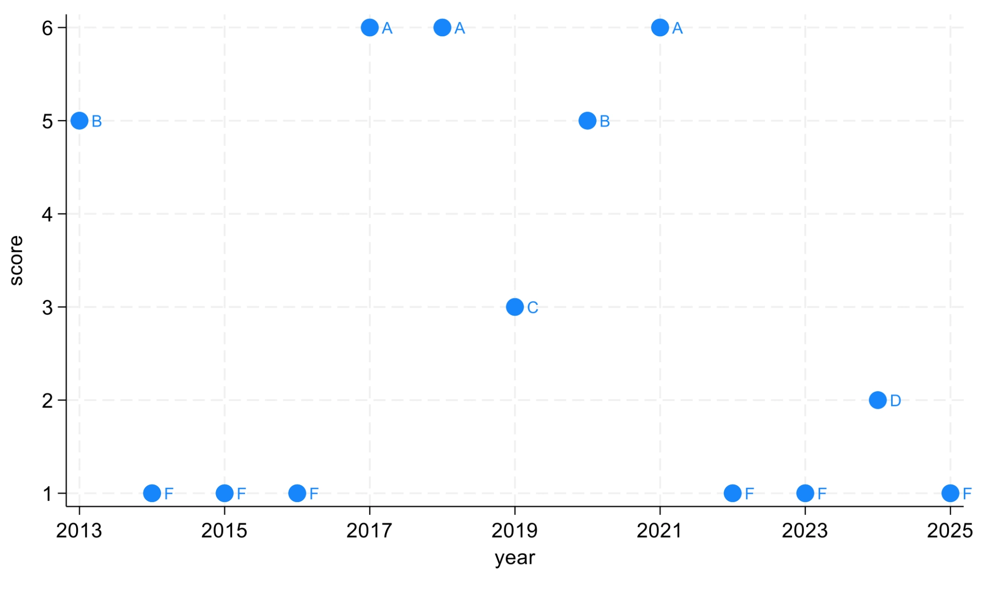
For the 13 years covered by this report card, the Fed has managed to achieve three As. However, it has received 6 Fs and one D. Since February 2022, the Fed has consistently performed at the D or F grade level. The previous string of Fs received from 2014 to 2016 was due to inflation falling below the Fed’s target. It is likely that the Fed cared more about these inflation misses than the public. The recent string of poor grades is due to inflation being above the Fed’s target. The public likely cares more about these inflation misses than the Fed.
In January 2020, the Fed adopted its Flexible Average Inflation Target (FAIT), where the Fed indicated that it would strive to have inflation average 2 percent over “some time.” The Fed subsequently dropped FAIT as inflation consistently came in above target. Keeping FAIT would have implied that the Fed would have to push inflation below 2 percent for the short-term in order to bring average inflation back to 2 percent.
While the Fed does not practice price level targeting, it is useful to compare where the price level is today compared to a “baseline” counterfactual price level where the Fed consistently met its 2 percent target rate each period. Let’s start this comparison at the last time 12-month inflation was near 2 percent. Here is the comparison starting in January 2021.
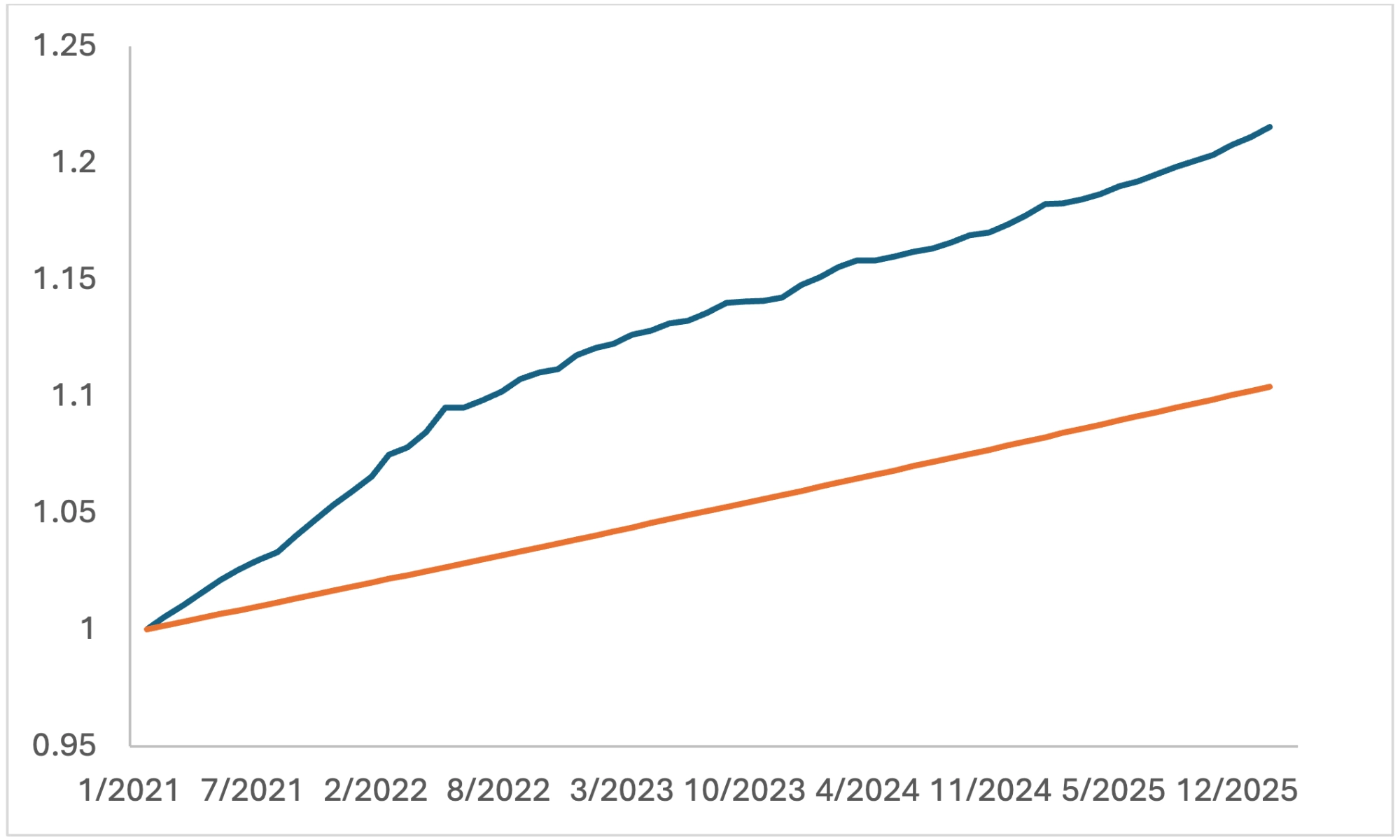
The price level gap is now slightly higher than 11 percent. Even if the Fed brings inflation down to 2 percent, prices are significantly higher than if the Fed had been able to consistently meet its target inflation rate post-COVID.
How does this inflation overshoot compare historically? I exclude the “Great Inflation” of the late 1970s and early 1980s. I also assume prior to 2012 that the Fed was implicitly targeting PCE inflation of 2 percent. Here is the historical comparison of inflation overshoots in terms of their duration in months and cumulative magnitude.
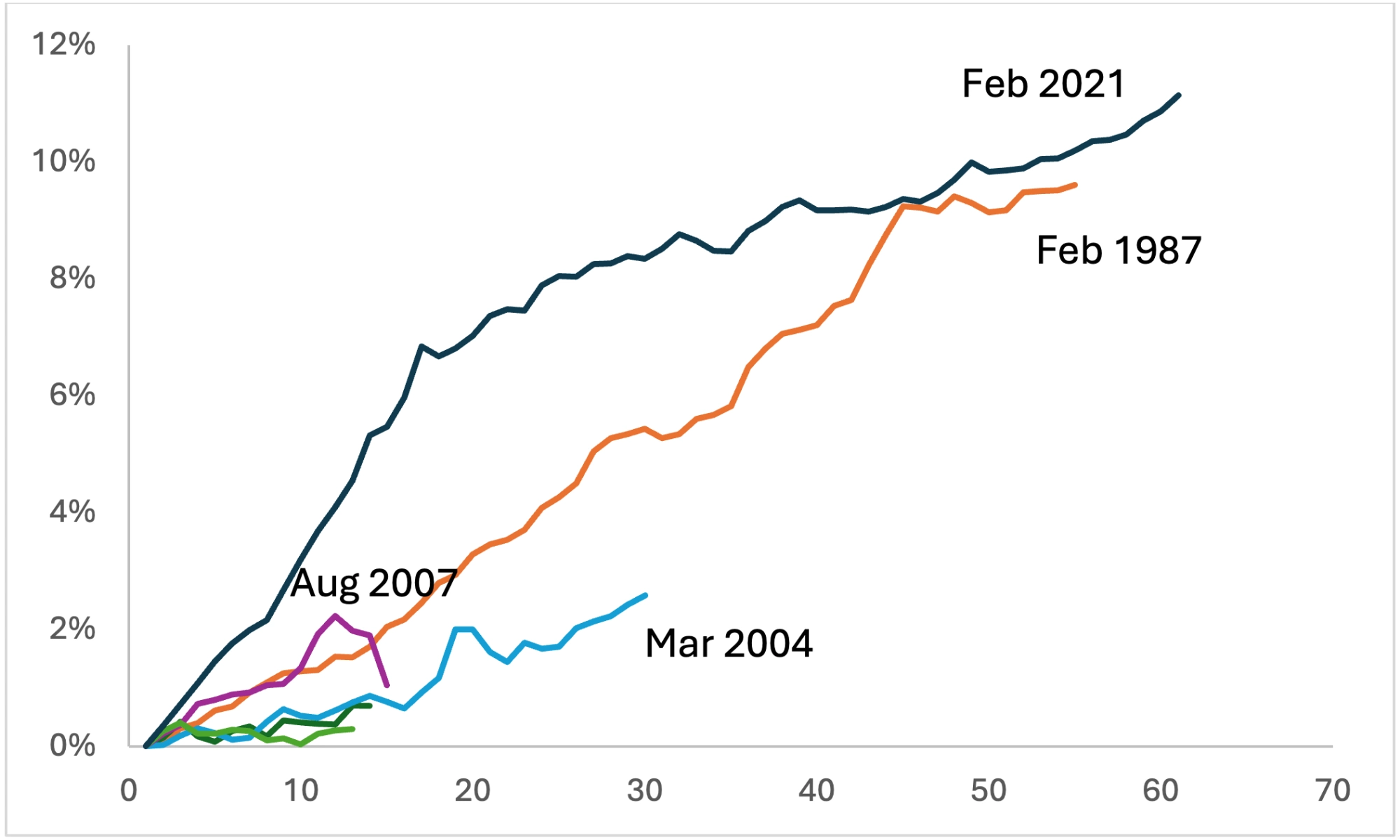
The current inflation overshoot is longer than the previous longest overshoot that began in February 1987. In addition, the magnitude of the current overshoot is now the largest.
Leadership at the Fed will be changing with the confirmation of a new board chair. Let’s hope that the new chair is successful in getting the Fed to focus more on improving its inflation performance. The Fed’s updated inflation report card is “nothing to write home about.” However, Vincent van Gogh painted a more optimistic picture when he said that “success is sometimes the outcome of a whole string of failures.” If van Gogh is right, then the Fed is poised for success.
Joseph Tracy is a Distinguished Fellow at Purdue University’s Daniels School of Business and a nonresident senior fellow at the American Enterprise Institute. Previously he was executive vice president and senior advisor to the president at the Federal Reserve Bank of Dallas. He regularly contributes insightful posts about financial markets to Daniels Insights.

