
09-04-2025
Most Purdue University students have heard it: “IU has the prettier campus.” “West Lafayette is gloomy and gross.” As a Purdue alum with plenty of IU ties, I’ve heard the comparison more times than I can count. And for years, I mostly believed it. Bloomington can just feel sunnier and livelier.
But recently, in true Purdue fashion, I decided to check the data.
And what I found surprised me.
I wanted to test this assumption by trying to define what “gloominess” might actually mean. While I’m no meteorologist, as someone who experiences weather (nearly) daily, I figured rain totals, number of rainy/sunny days, and average temperature, while not fully exhaustive, were reasonable places to start.
I pulled weather data from the National Oceanic and Atmospheric Administration’s Online Weather Data portal and cross-compared Bloomington and West Lafayette (I also ran it by an IU alum, just to double-check my biases).
Here’s what I found:
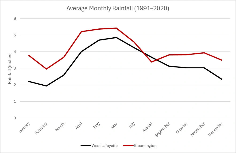
Bloomington actually gets more total rainfall than West Lafayette.
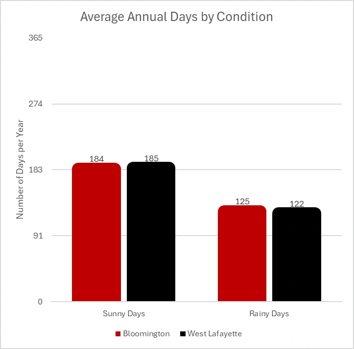
Both towns have a similar number of sunny/rainy days per year — Bloomington technically has one less sunny day, and three more rainy days on average.
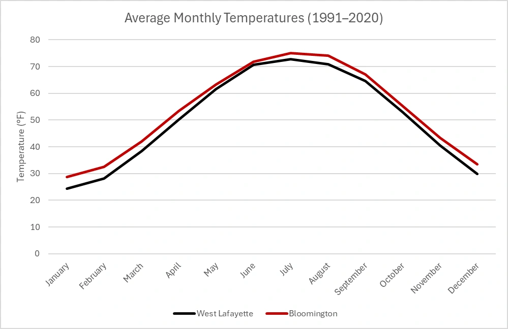
Average temperatures across most months are slightly higher in Bloomington — by about 3–4 degrees. Not nothing, but hardly enough to explain the perception gap. (Although 54 degrees on the Kilroy’s patio probably feels about 20 degrees warmer than the same day on the Chipotle patio in Chauncey, to be honest.)
Even when accounting for the months that school is in session, the pattern holds. There’s no clear evidence that Bloomington scores noticeably better than West Lafayette. At best it’s a tradeoff: more rain but slightly warmer temperatures.
So why does this perception linger? Why does Bloomington feel brighter to many people? Is it mostly a pro-IU bias that has turned a state rivalry into a broadly accepted public perception?
You might hear a Purdue fan say Bloomington is overhyped, or an IU fan claim that numbers can’t capture the campus vibe. Both reactions have a kernel of truth, but the more interesting question isn’t who’s right — it’s why our impressions can diverge so strongly from the data. And that tension, between the story we tell and the numbers underneath, shows up far beyond Indiana campuses.
“Gloom” isn’t a cleanly defined metric. You can’t measure it in inches of rainfall or degrees Fahrenheit alone. Maybe it’s the hills or the fall colors. Maybe it's the layout or architecture. Maybe “gloom” is just a vibe — and vibes, in my experience, are hard to quantify.
This wasn’t just a weather debate anymore. It was a case study in something deeper: the ongoing tension between intuition and analysis.
Nobel Prize-winning psychologist Daniel Kahneman famously described two modes of thinking:
Importantly, Kahneman didn’t argue that System 2 is always better. Each has its strengths and vulnerabilities. Intuition helps us navigate uncertainty and make quick decisions, but it’s also prone to bias. Analysis can sharpen our judgment, but only if we’re measuring the right thing.
This raises two questions worth asking anytime we evaluate data:
Subjective experiences often contain real truth, but that doesn’t mean they’re always measurable in a traditional sense.
Sometimes places can feel sunnier or gloomier, not because of measurable factors like rain or temperature, but because of the context, subjective experiences and personal memories people attach to it. Metrics alone rarely tell the full story.
In a world flooded with metrics and dashboards, it’s tempting to either blindly trust the numbers we like or dismiss them entirely when they don’t match our instincts. But smart decision-makers do neither.
They use intuition to spark questions and data to test assumptions. They ask whether their metrics are truly measuring what matters. And they know that when it comes to human experience, some things can’t be cleanly captured in rows and columns.
Yes, sometimes intuition reveals patterns that data misses like vibes, aesthetics and nostalgia. And yes, sometimes data challenges false beliefs that feel true.
The real skill lies in knowing when to use each and how to use them together. Smart decision-makers don’t blindly trust either system. They toggle between them, knowing their strengths and limits.
As Kahneman likely would have put it: Intuition is recognition. When a pattern is deeply familiar, intuition can be trusted. But when you’re outside your domain of expertise or when the stakes are high, slow thinking is essential.
In my experience, the best outcomes come from understanding how data is defined, recognizing when intuition is valid, and staying humble about the limits of both.
Sometimes talking about the weather is enough for a casual conversation. Other times, the weather isn’t the full story.
The better we get at asking what exactly we’re measuring, the more we can use data not to erase intuition, but to deepen it.
Colin Myers (BS ECON ’18) is a media analytics manager with Circana, a market research and technology company.

