Building the future of Business
This is your guide to understanding the Mitch Daniels School of Business’ identity — tech-focused, data-driven, and STEM-infused. It offers the tools and resources needed to create consistent visuals and messaging that align with our mission of preparing next-generation leaders for an ever-evolving future.
This section outlines how to represent the Daniels School in both text and visual treatments. It covers the use of the co-brand and school name in copy and guidelines for using the school's name in formal, informal, and acronym formats. These standards ensure consistent and clear representation across all communications while maintaining alignment with Purdue’s brand and the legacy of Mitch Daniels.
Building brand awareness for the Mitch Daniels School of Business is essential due to its new name and positioning. We offer two treatments: the traditional Purdue co-brand and a copy treatment.

NOTE: If the co-brand is necessary and spacing is limited, the condensed version should be used. This version should only be used with the approval of the Daniels School’s Marketing & Communications team.
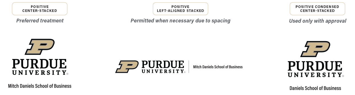
Visit the Purdue Brand Studio to download the Daniels School’s or a specific unit’s co-brand.
Download Co-BrandEstablishing a standardized approach to nomenclature for the Daniels School of Business is essential for maintaining consistency across all communications. This unified language ensures that marketers, communicators, ambassadors and advocates represent the brand clearly and cohesively. It also strengthens the connection with Purdue’s institutional brand and the legacy of Mitch Daniels, enhancing brand recognition and differentiation in the marketplace.
| FORMAL NAME | INFORMAL NAME | ACRONYM / ASPIRATIONAL | |
|---|---|---|---|
| Category | MITCH DANIELS SCHOOL OF BUSINESS | DANIELS SCHOOL OF BUSINESS | DANIELS / PURDUE DANIELS |
|
WHY IT WORKS
|
|
|
|
|
WHEN TO USE
|
|
|
|
|
KEEP IN MIND
|
|
|
|
The visual elements of the Daniels School brand are designed to align with the Purdue identity while ensuring the school’s distinct presence. Our typography, color palette, photography and graphic elements work together to create a cohesive yet standout visual language.
Our color palette ties directly into Purdue’s primary colors of Black and Boilermaker Gold. This allows for a direct connection that embraces the ethos of one Purdue.
In rare instances, a composition may need a neutral or accent element to stand out from our primary colors. When that is the case, we lean on Purdue’s supporting palette and pull from these color builds. All neutrals should be used sparingly.
CMYK 0 C 0 M 0 Y 100 K
HEX #000000
RGB 00 R 00 G 00 B
BOILERMAKER GOLD C
Pantone 7502
CMYK 13 C 20 M 45 Y 3 K
HEX #CFB991
RGB 207 R 185 G 145 B
CMYK 63 / 51 / 45 / 33
HEX #555960
RGB 85 / 89 / 96
CMYK 50 / 40 / 34 / 17
HEX #6F727B
RGB 111 / 114 / 123
CMYK 34 / 30 / 33 / 8
HEX #9D9795
RGB 157 / 151 / 149
CMYK 20 / 17 / 19 / 0
HEX #C4BFC0
RGB 196 / 191 / 192
CMYK 0 / 0 / 0 / 0
HEX #FFFFFF
RGB 255 / 255 / 255
CMYK 14 / 29 / 62 / 12
HEX #8E6F3E
RGB 142 / 111 / 62
CMYK 0 / 20 / 100 / 8
HEX #DAAA00
RGB 218 / 170 / 0
CMYK 5 / 18 / 81 / 4
HEX #DDB945
RGB 221 / 185 / 69
CMYK 3 / 8 / 43 / 0
HEX #EBD99F
RGB 235 / 217 / 159
When it’s used thoughtfully, typography becomes a powerful brand tool that can add visual meaning to what we say. Our typography communicates clearly and cleanly, with enough flexibility for a wide range of situations.
Acumin Pro Regular
The Daniels School of Business is for those who have eyes on the future. Those who thrive at the cutting edge of where business and innovation meet.
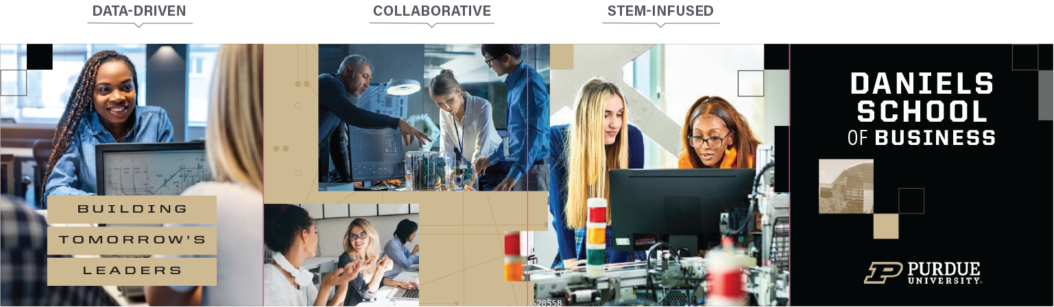
Photography plays an important role in our brand communications because it tells our story visually. When paired with our words, images offer powerful proof of what we say: We’re collaborative, STEM-infused and data-driven.

Showing multiple people together — whether they’re working, studying, talking — communicates connection and synergy.

Take people out of the expected boardroom setting and instead show them working with technology and accessing innovative resources.

Incorporate graphs, charts and numbers when it feels organic to demonstrate the layered approach to problem solving.
The key themes are what differentiate Daniels from other business schools. Using photography to showcase these principles in bright, fresh ways communicates the unique pull. When possible, show multiple images. That way, viewers can see people collaborating, incorporating critical STEM principles and observing data — all at once. It’s a story of what happens here every day.
Images used in this section are stock photos that are not owned by Purdue. Therefore, they may not be used in Purdue designs, including print and digital projects. They are featured as inspiration for future photo shoots and direction for lighting.
Our creative strategy utilizes intentional design elements to convey the Daniels School’s vision and values. Connection points visually link real-life imagery to broader themes, reinforcing a cohesive and influential narrative. Building blocks symbolize growth and structure, serving as visual metaphors for constructing a future grounded in innovation and progress. These elements work together to create a dynamic and unified design framework that resonates with our audience.
The use of connection points in the background of designs links those day-in-the-life images and strengthens Daniels’ STEM-infused messaging.
Element Colors
Boilermaker Gold set to multiply at 50% opacity on top of a Boilermaker Gold background.
Proportions
Circles should be no larger than half the size of the main building block.


The graphics should remain in their original orientation to ensure that most lines relate to the images at 90-degree angles.

By incorporating building blocks as an overlay, designs can convey the core theme of constructing a strong future.
Building Blocks: Solid

Building Blocks: Outline


Use building blocks on solid backgrounds to add structure.
Building blocks create interlocking borders between color fields and photographic elements, conveying a construction theme.
In some blocks, including Daniels School architecture in duo tone can be a connection to campus and a way to honor the history of the school.
Our voice and tone provide a clear framework for communicating on behalf of the Daniels School of Business. They help in crafting messages that are consistent, authentic and aligned with our brand identity. The brand narrative serves as a guide to tell our story, offering inspiration for phrasing and tone. Key themes provide focus for messaging, highlighting what sets Daniels apart and connecting it to our future-driven vision. Together, these sections equip faculty, staff and partners with the tools to communicate effectively and cohesively across all audiences and platforms.
This tells our story at a high level and sets the tone for brand language. It isn’t intended to be used word for word in external communications. It’s an inspiration to pull relevant phrases, adopt a similar tone and mirror construction.
Building the Future of Business
Welcome to the business school of the future.
Tech-focused, data-driven, STEM-infused, the Daniels School of Business equips next-gen leaders and visionary founders for an evolving tomorrow.
Students learn in a real-world environment where business merges with STEM and the humanities. They are supported by a 150-year legacy of innovation and persistence. And they build comprehensive expertise in the key areas that will drive future success — like new tech, AI and emerging engineering fields.
This is how the future of business is built.
The language from our brand narrative is a guide for all other communications. Its spirit, tone and energy can help ensure you’re using the brand voice appropriately and communicating in a similar style.
Ensure that our personality comes through.
The tone of what you’re writing should capture the spirit of this narrative and convey its inspiring, confident feeling. It should help you make appropriate choices to convey our relatable voice. Make sure whatever you’re writing sounds like it’s coming from a person who possesses our personality traits and who sounds like the language in our narrative.
Give context to our messaging.
We have a wide variety of stories to tell and plenty of information we need to deliver. By couching this information within an interesting and compelling narrative framework, we can help ensure that our message is not only received but also remembered. When all of our content aligns with this positioning, we give our message heightened meaning and greater relevance.
Maintain consistency.
When every communicator uses the narrative as a guide, we can ensure that all communications work together as a family, with one common voice and a consistent brand identity.
Amplify our story, ensuring that it is heard.
By keeping our communications consistent, compelling and clear, we can create a powerful message. Together, we can share one story, multiple times, across all media, with all our audiences.
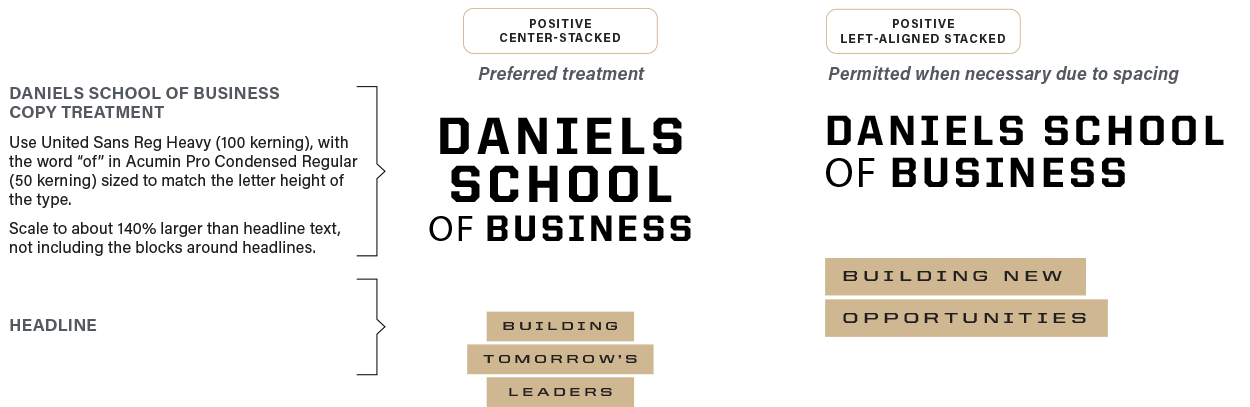
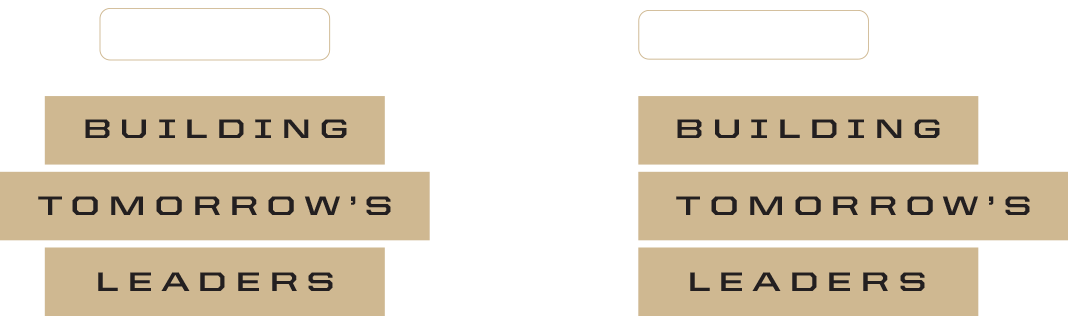
The Daniels School of Business is building the next generation of business leaders. Educated in a collaborative learning environment, graduates are ready to construct what’s next around the world. A good place to begin is with headlines using that key concept: “building.” Pair it with concrete examples that imply a future-focused mindset, using words like “tomorrow,” “new” and “next.”
▶ Building tomorrow’s leaders
▶ Building new opportunities
▶ Building the next solutions
We offer a wide variety of services. From concept to completion, we’re here to help.
Get Started
